WebWatch: Testing Web Page Design Concepts for Usability
In order to identify the extent to which visual designs assist users to locate particular elements that might be contained on a Web page (such as search, site-wide navigation, and local navigation), we used a usability testing method described by Tullis [1] to test a set of five Web page design concepts. All text elements on each of the designs were "greeked", or turned into nonsense text. This meant that users had to rely on the communicative aspects of each design in order to perform their tasks.
A number of issues influence the usability of a Web site and can be difficult to separate in a traditional usability test [2]. Did the user fail to complete her task because the information architecture was poorly designed? Or was it because the content was badly written? Or perhaps the visual design was responsible in some way?
In working on the redesign of the Monash University Web site [3], we were keen to ensure that each aspect of the design effort was evaluated. We tested paper prototypes to ensure that navigation labels and content groupings made sense to our users. We developed wireframes to provide basic page layouts and subjected these to usability testing as well.
We were keenly aware that the visual design of the old site was one of the primary factors in its poor usability. Users could not find the search facility because it was hidden in the footer of each page. The text was too small. Local navigation (links to content within a particular section of the site) was not highly visible and often overlooked as a result. Users frequently became disoriented and had no idea of where they were within the very large and complex site.
The project team was aware of a range of design problems that needed to be addressed. We had ideas about how the problems might be solved, and detailed these in a visual design brief. However, we needed to verify that the visual design concepts we had solicited would in fact resolve the issues, and we also wanted to ensure that they did not introduce new usability problems.
We set out then to identify the extent to which visual designs that had been submitted assisted users to locate particular elements that might be contained on a page, such as search, site-wide navigation, and local navigation.
Methodology
The project team set up a table in the Campus Centre at the University's Clayton campus and in the Student Lounge at the Caulfield campus. Test participants were recruited at random. Participants were advised that testing would take approximately five minutes, and in return for their participation they could enter their name into a draw to win one of four $30 book vouchers.
Three sets of usability tests were conducted - one for each of the page levels for which a design concept had been requested: the home page, section home pages, and content pages. Each set comprised the five short-listed designs, and each user was asked to perform tasks on one set of designs.
Following a method described by Tullis [1], all text elements on each of the designs were "greeked", or turned into nonsense text. This meant that users had to rely on the communicative aspects of the design in order to perform the tasks. Logos and images were not altered.
A standard test script was read to the user, explaining the nature and purpose of the test, and demographic data were collected. Users were then shown each of the five designs in random order and given a set of tasks to perform. Each task involved the user locating and drawing a circle around a particular page element.
Once all of the tasks had been completed for each design, users were asked to rank the designs in order of their preference.
A total of 135 participants took part in the study, 45 for each set of designs. Participants included 69 staff (56 general staff and 13 academics) and 66 students (53 undergraduates and 13 postgraduates; 13 were international students).
The "greeked" Web Page Design Concepts
The following show the home page version of the "greeked" Web page design concepts that were tested.
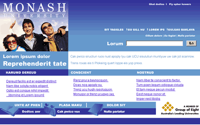
Design A
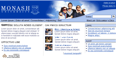
Design B
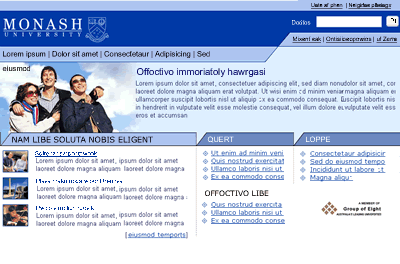
Design C
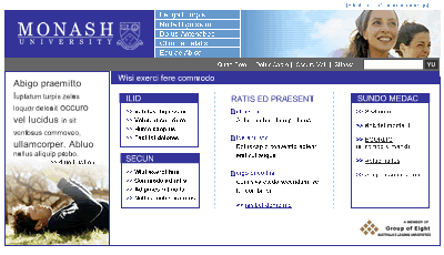
Design D
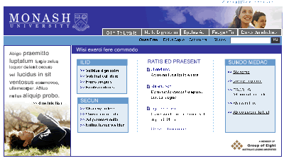
Design E
For further information on how each of these designs performed, it is possible to examine our findings in detail contained in poster presentations [4].
Performance Results
As with the Tullis study, we were quite generous in determining whether a participant had successfully completed a task. If their selection included the correct element, it was considered correct even if it also included incorrect elements.
Overall, design C performed the best, with 87% percent of tasks correct. Design B was next best with 85%, followed by Design D at 82% and Design E at 81%. Design A performed worst overall, with 75% of tasks correct. Individual results for each of the three sets of tests are shown in table 1 below.
| Test area | A | B | C | D | E |
|---|---|---|---|---|---|
| Home Page | 61 | 72 | 76 | 67 | 68 |
| Section Home Page | 96 | 92 | 94 | 93 | 93 |
| Content Page | 67 | 88 | 88 | 80 | 84 |
| Overall | 75 | 85 | 87 | 82 | 81 |
In his study, Tullis combined the successful elements of each design and did further testing. The results indicated improved user performance. Our project timeline did not permit retesting, but the performance data confirmed our initial (pre-testing) views about the strengths and weaknesses of each of the design concepts.
In terms of the home page designs, we believed a likely weakness of designs D and E was the "Quicklinks" component (shown at the right side of the page) which was more visually prominent than the main content entry points. Also, the design of the news component could have been improved. With design A, we felt that users would not easily be able to tell the difference between the news section (the first set of links on the left) and the main content entry points, (the middle and right side set of links). We were of the view that this design also gave too much prominence to the "Quicklinks" component, (the lower section of the page marked by the use of icons). The performance data established this: Designs B and C outperformed designs A, D and E in the tasks where users had to locate the main content entry points and news items, as table 2, below, shows.
| Tasks | A | B | C | D | E |
|---|---|---|---|---|---|
| Locate main content links | 49 | 67 | 76 | 60 | 54 |
| Locate news items | 56 | 73 | 82 | 64 | 64 |
With the content page designs we were concerned that the failure to underline hyperlinks in the local navigation component would diminish user performance on designs D and E. We thought users may select the "Related links" section instead as the links in that component were underlined. In design A, we were of the view that the page title would not be easily located as a sub-heading was given too much prominence on the page. The performance results again confirmed our views. Designs A, B and C scored better than designs D and E for locating the local navigation. Designs B, C, D and E outscored design A in the task that required users to locate the page title. The results are shown in table 3 below.
| Task | A | B | C | D | E |
|---|---|---|---|---|---|
| Locate local navigation | 71 | 89 | 87 | 44 | 44 |
| Location page title | 2 | 89 | 89 | 96 | 96 |
No obvious usability problems were predicted with the section home page designs, and the performance data for each of these were fairly strong, and even, with only 4 percentage points difference between the top scorer, Design A (96%) and the bottom, Design B (92%).
User Preference Results
At the end of the test, users were asked to rank the designs in order of their preference. The user's first preference was allocated 5 points, their second preference 4 points, and so on, with the user's last preference being allocated 1 point.
During the testing the project team noted that Design A evoked fairly strong reactions from test participants. A minority reacted to it in a favourable way, but overwhelmingly, the reactions were negative.
Overall, Design E performed best, with 443 points (out of a possible maximum of 675) and was the first preference of 24 percent of participants. Design A performed worst, with just over half of the participants ranking it last. Table 4, below, shows the details of the users' preferences.
| Users' preferences | A | B | C | D | E |
|---|---|---|---|---|---|
| 1st preference | 16.2 | 21.4 | 21.4 | 21.4 | 23.7 |
| 2nd preference | 5.9 | 19.2 | 23.7 | 27.4 | 23.7 |
| 3rd preference | 15.5 | 25.0 | 14.8 | 20.7 | 23.7 |
| 4th preference | 6.6 | 17.0 | 32.5 | 22.2 | 20.7 |
| 5th preference | 55.5 | 18.5 | 7.4 | 9.6 | 9.6 |
Conclusions
The project team felt that testing the design concepts was a useful exercise. It allowed users to participate in the design process and some were quite excited about getting a sneak preview of the new design. We were confident that the testing highlighted potential problems because the results matched our initial predictions about design elements that might lead to usability problems.
The test results were welcomed by the management team who found the test result data provided a useful input in deciding which of the designs would be implemented.
References
- Tullis, TS (1998), A method for evaluating Web page design concepts, in ACM Conference on Computer-Human Interaction, CHI 98 Summary, 18-23 April, pp. 323-4.
- Nielsen, J (1998), Testing Whether Web Page Templates are Helpful
http://www.useit.com/alertbox/980517.html - Monash University Web site http://www.monash.edu.au/
- Web page: Testing Web Page Design Concepts for Usability http://deyalexander.com/papers/ausweb03/poster-testing/#posters
Authors' Note
The design that was ultimately implemented on the Monash University Web site differs in some respects from Design E as shown above. This is because a new brand and brand architecture was introduced shortly after the testing had concluded. The project team also made some modifications to the design based on the results of the testing.
