Reading Van Gogh Online?
Large amounts of money are spent building scholarly resources on the web. Unlike online retailers, large publishers and banks, scholarly institutions tend not to monitor very closely the way visitors use their web sites. In this article I would like to show that a look at the traces users leave behind in the Web servers’ log files can teach us much about our sites’ usability and about the way visitors use them.
In 2009 the Huygens Institute [1], together with the Van Gogh Museum [2], published a new edition of the letters of Vincent van Gogh. The complete edition was published online [3], and is accessible for free; there is also a six-volume book edition [4]. The online edition was reviewed in a number of publications [5][6][7]. I will use the server logs of the Van Gogh edition as an example of what we can learn about our visitors. I will focus not on the simple quantities, but try to assess the visitors’ access patterns. When we created the edition, our assumption was that researchers would use the web site, while people who wanted to read the letters would favour the book. The desire to test that assumption was one of the reasons for embarking on this investigation.
When users view, or read, editions online, busy traffic is going on between their browser (e.g. Firefox, Internet Explorer, Safari), and the web server where the edition is located. Web servers keep logs of this traffic, and inspecting the logs gives us an opportunity to see how people are actually using the editions that we create. When people buy a book, this shows their intention to use it, in some sense. When people go to a web site, the server registers their visit, including, depending on the design of the site, every page they read and every search they do.
Most of the work on log analysis in scholarly environments has been done in the context of libraries researching use of electronic journals [8]. The financial interest in accurate knowledge about usage patterns in that context is obviously important. The LAIRAH (Log Analysis of Digital Resources in the Arts and Humanities) study [9] used log analysis on portal sites in order to assess usage of digital resources in the arts and humanities. I believe the present article is the first reported study on actual usage data of a scholarly digital edition.
First I will discuss why these log data deserve investigation. I then will show what the data that we collect looks like and discuss both their potential and their limitations. I will give a brief overview of the edition site, as the log data can only be understood in the context of the site’s structure and navigational facilities. Then I’ll show a number of the things that can be done on the basis of the log files.
Analysing Log Data
There are four reasons why one would want to know about user behaviour. Three of them are very practical:
- to identify usability problems with the site;
- to check the popularity of the site’s components – usage may help decide on which features to include in new editions, or perhaps which features need more work; and
- to be able to customise the site to the user, displaying more prominently the data that a specific user might be interested in. A more theoretical reason would be the desire to learn about the sorts of visitors attracted to the site, the reasons for their visit and the extent to which the site satisfies that interest.
There are several ways of collecting this information. One would be having a number of test users execute a number of prepared tasks and observing them during that exercise; another would be a questionnaire. The advantages of log data are that they can show what real people actually do. In surveys people tell about what they have done or will do, or ought to do; test users are observed in a very artificial situation. Log data are more real and more complete; on the other hand, of course, it is difficult, if not impossible, to infer motives, reasons and satisfaction levels from data about file requests. And even at lower levels the interpretation of the data has its own hazards.
Possibilities and Limitations
Let us look at a single line of a typical log file, to see what it can help us do:
82.69.23.44 - - [04/Apr/2010:18:21:26 +0200]
      “GET /vg/letters/let805/letter.html HTTP/1.1” 200 13028

          “http://vangoghletters.org/vg/by_period.html"
      “Mozilla/4.0 (compatible; MSIE 7.0; Windows NT 5.1;
      (…).NET CLR 3.5.30729; SiteKiosk 7.1 Build 267)”
What this shows is, among other things:
- An IP address: the address assigned to the computer by the ISP (Internet Service Provider). Usually it is fixed on broadband connections; it is variable when dialling in. Unless you are the police, it is impossible to find out the actual user from the IP address. Large organisations often use a single IP address to connect to the outside world. In that case, a whole university may use one and the same address.
- Timestamp of the page request
- The page requested, with some technical information; here we see a request for letter 805
- Response code, 200 indicating that the page was delivered as requested
- Referrer: the page from which the request originated, here a table of contents of the letters by period
- User agent string: helps determine the computer operating system (here Windows XP), the browser (Internet Explorer), and several other properties.
When using this form of server log analysis, there are a number of things to keep in mind:
- The server records the request for every object, and a regular web page can consist of tens of components: pictures, image files for icons on the page, files that define the page style and layout, scripts to be run, etc. The log files can easily grow very big. The file for the week in April 2010 that I have been studying is 170 MB in size. As a consequence it is all but impossible to do anything useful with it without some sort of tool.
- Conversely, the server records only what the browser asks for. If a user presses the back button, for instance, the page is probably still in the browser cache, its temporary storage area, and there will be no need to go back to the server. Similarly, every user request that a script in the browser can service without asking the server, will not be recorded in the log. Nor can we see when users leave the site (or, when they decided to take a break, were interrupted by a phone call, etc.).
- There is no concept here of a user session. The best we can do is to combine IP address and user agent and consider sequential requests from the same combination to be a session.
- Lots of the traffic recorded in the logs does not come from humans. Search engines such as Google crawl the site to index the pages, and there are many other programs visiting the site, for good or evil purposes.
Some of these limitations may be circumvented by different logging parameters, or by modifying the web pages to change its interaction with the server.
The Site
In order to make sense of the data under discussion, it is worthwhile forming a better picture of the Web site [10].
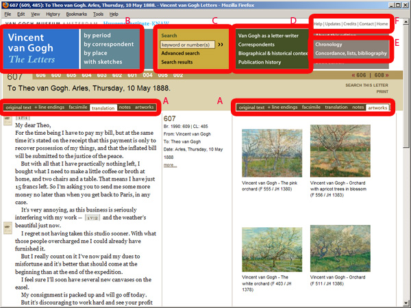
Figure 1: Vincent van Gogh – The Letters: Letter 607.
Its main element of course is the letters. There are about 900 of them, mostly to Van Gogh’s brother Theo, but also letters exchanged with other family members and artist friends. A letter page may look as in figure 1, with translation and thumbnails of the artworks discussed in the letter side by side. Using the tabs (A), the reader can choose to see instead the original text, a facsimile, or notes. The user can choose to view a picture discussed in the letter or can zoom in on a facsimile. Therefore, viewing a letter is not a single event. The body of letters is framed by a series of pages designed to help readers find their way around in the site and inform them of the backgrounds. This menu is available on all of the site’s pages. First there are tables of contents (B), of all the letters, by several criteria such as correspondent, period or place, and a list of all letters with sketches.
Then there are search facilities (C); a simple search, where one can enter a word or phrase (or a letter number); and an advanced search, where people can search by multiple criteria, such as correspondent, date, work of art, etc. Searches for things like works of art and persons can also be done by clicking on hyperlinks included in the letter pages or from an index. Next we have essays (D), texts that explain Van Gogh’s letters, their publication history and the present edition; and pages that I have called lists (E): a chronology of Van Gogh’s life and various overviews, including a concordance, maps of the relevant places, the indices and the bibliography. Finally, there are some pages that I have grouped under the label ‘border’ (F), because they are mostly referred to at the border of the page: help, updates, credits, copyrights, a reference to the book edition, etc.
Findings
To conduct this analysis I started with logs from one week in April 2010. Still on the list of things to do is to repeat this exercise with data from a number of months. The analysis proceeds in a number of steps:
- cleaning the log data (removing server housekeeping, bots, requests for irrelevant files, and extra IP addresses);
- analyse the log and arrange it into a logical representation of the steps taken by the user (in spreadsheet format);
- sort by session;
- derive data for overviews, counts and graphics.
Aggregate Data: Types of Pages Accessed
We will begin by looking at aggregate data. What sorts of pages do people visit? As can be seen from Figure 2, a large majority of the visits is to the letter pages, as one would expect. The various lists account for only a marginal fraction of the visits, for the rest all page types have decent visitor numbers.
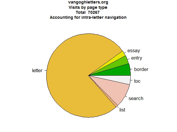
Figure 2: Visits by page type
If we look at the specific sub-page types within the letters (Figure 3), there is a preference for the translated text. It does not seem very strong, but that is because initially, the system always fetches both the translated and original text. The notes are also popular, but are also fetched by default. Facsimile and artwork tabs are also used, people ask for the illustrations, they do zoom in on the facsimile. Conversely, the options they use least are looking at the version that shows the original line-endings and especially the print version. It would not have surprised me if more people had used the print version.
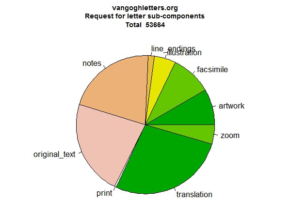
Figure 3: Letter page sub-type
Let us look at two more: search (Figure 4) and tables of contents (Figure 5). The overview of search pages confirms the conventional wisdom of site designers: people do not like advanced search. They prefer simple search, they also use the ‘reference’ search (those are searches embedded in hyperlinks in the text, where clicking for instance the name of a person brings up a list of occurrences of that person in the site), but they hardly use the advanced search. From the overview of tables of contents it appears all of them are used regularly. The list of letters with sketches is also frequently accessed.
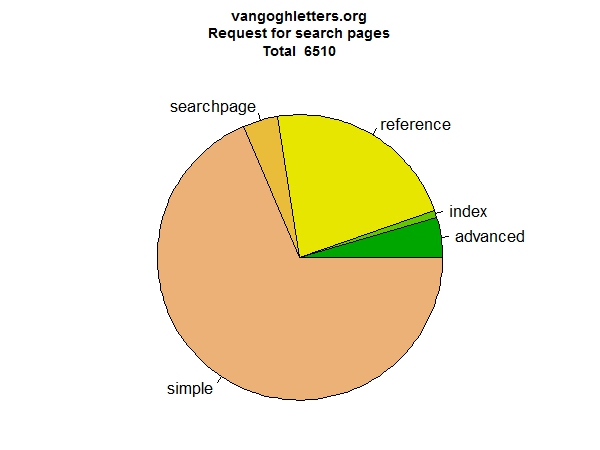
Figure 4: Search page types
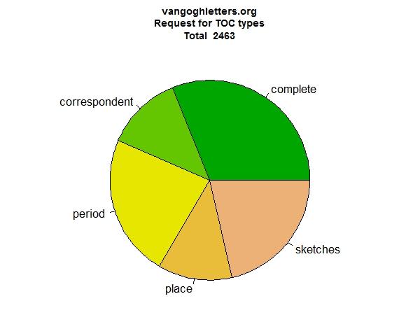
Figure 5: Table of content pages types
If we want to understand why it is that one page is more popular than another, the next step is to look at how people navigate between pages. Let us start at the home page (Figure 6). At the left we see most people arrive at the home page from outside, and at the right we see where people go from the home page. Many ask for information about the book edition (we like that), but more start by searching.
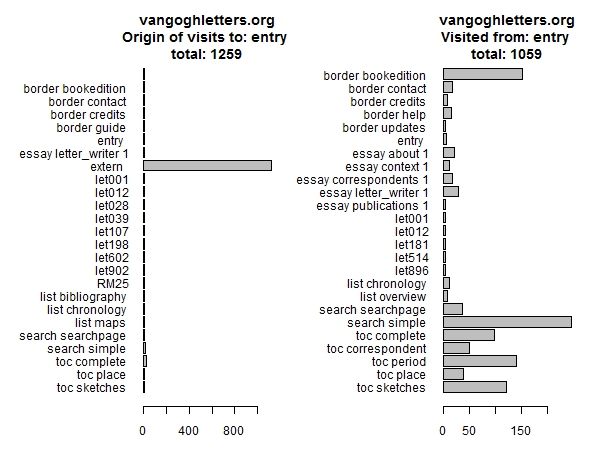
Figure 6: Previous and next page for home page visitors
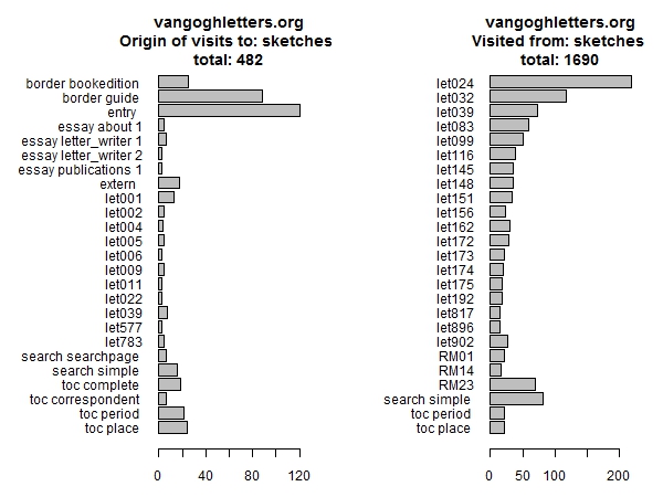
Figure 7: Previous and next page for list of sketches
Another graphic shows the same data for the list of letters with sketches (Figure 7). We notice that many people click on the first letter with sketches (letter 24), somewhat fewer click on the second (32), and thereafter the numbers quickly decrease further.
Aggregate Data: Favourite Letters
A plot of favourite letters (Figure 8) shows which letters are the most popular. There are too many letters to show that in detail, but it gives an impression. Most people start at the first letter. The peak at the end is the last letter, presumably read because of the dramatic circumstances of Van Gogh’s suicide. The peaks at the beginning are the letters with sketches, which as we just saw are very popular. Other peaks correspond with letters exhibited at the Royal Academy in London, which was hosting a large exhibition at the time.
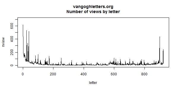
Figure 8: Views by letter
For these letters again we can check where visitors came from and where they went afterwards. Here is the information for letter 902, the last one (Figure 9). Unlike most other letters, the majority of viewers of letter 902 deliberately selects the letter from one of the tables of contents, rather than entering it from the previous letter.
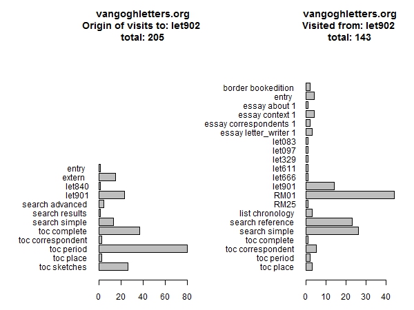
Figure 9: Next and previous pages for letter 902
Top Searches
From a usability perspective, a look at the searches that people perform on the site is very instructive. These are the top 15 searches using the simple search facility (Table 1):
| Search term | Sessions |
| keyword or number(s) | 52 |
| jo introduction | 10 |
| sunflowers | 9 |
| ? | 6 |
| theo | 4 |
| last letter | 4 |
| portrait | 4 |
| starry night | 4 |
| death | 4 |
| potato eaters | 4 |
| self portrait | 4 |
| paris | 4 |
| van gogh | 3 |
| sunflower | 3 |
| anna | 3 |
Table 1: Top simple searches
We report the number of sessions rather than the number of searches because quite a number of people seem to repeat the same query over and over. The first entry points at what is apparently a usability problem with the site: ‘keyword or number(s)’ is the default content of the search box, and people search without entering a search term. The next one indicates another problem: someone who seems to try to search for Jo, Van Gogh’s sister-in-law, in the site’s introduction (which unfortunately cannot be searched at present). There are some other usability issues that appear from inspecting the search terms used (not shown in the table). Sometimes people search for a date, perhaps not knowing that there is a full table of content of all the letters. Many people do not understand that they can search for phrases by putting them between double quotes.
What is certainly a usability issue is the apparent need for a spell checker. Table 2 shows searches for sunflowers. Sometimes one can see people correcting themselves, but often they give up. Perhaps Google has made us lazy.
| suflower, suflower painting, suflowers, suflowr, sulowe, sumflowr, sun flouwers, sun flower, SUN FLOWER , sun flowers, SUN FLOWERS, sun flowers by Van Gough, sun flowrs, sun fower, SUN OWER, sunflouers, sunflower , sunflower painting, sunflowers, Sunflowers, SUNFLOWERS, sunflowers , sunflowes, sunfower, sunfowers, SUNFOWERS, sunfowers , sunfowes, sunlowers |
Table 2: Searching for sunflowers
Table 3 shows searches for works of art (these are searches for the indexed references to works of art, not plain-text searches):
| Search total | Search reference | Search advanced | Search index | Work of art |
| 37 | 36 | 1 | 0 | The bedroom (F 482 / JH 1608) |
| 18 | 17 | 1 | 0 | The bedroom (F 484 / JH 1771) |
| 9 | 8 | 1 | 0 | The bedroom (F 483 / JH 1793) |
| 5 | 2 | 3 | 0 | The potato eaters (F 82 / JH 764) |
| 4 | 0 | 4 | 0 | Shoes (F 332 / JH 1234) |
| 4 | 4 | 0 | 0 | Paul Gauguin - Madame Ginoux |
| 4 | 1 | 3 | 0 | Sunflowers in a vase (F 453 / JH 1559) |
| 3 | 0 | 1 | 2 | Nude woman on a bed (F 330 / JH 1214) |
| 3 | 1 | 0 | 2 | Nude woman, reclining (F 1404 / JH 1213) |
| 3 | 2 | 1 | 0 | Reclining female nude (F 330 / JH 1214) |
| 3 | 3 | 0 | 0 | The night café (F 463 / JH 1575) |
| 3 | 0 | 3 | 0 | Shoes(F 461 / JH 1569) |
| 2 | 2 | 0 | 0 | Portrait of a woman (F 328 / JH 1212) |
| 2 | 2 | 0 | 0 | De Nittis - Victoria Embankment in London |
| 2 | 2 | 0 | 0 | Rembrandt van Rijn - The archangel Raphael |
Table 3: Searches for works of art. (Works are Van Gogh’s unless noted otherwise.)
As it appears, the Bedroom is by far the most popular Van Gogh painting, its three versions occupying the top places. This is no doubt the effect of the restoration of the painting going on at the time, which was being reported in a popular weblog.
It is interesting to note that most of these searches were not started by typing a query (the Search advanced column), but by clicking on a ready-made link to the search results (Search reference). These searches, by the way, can only work because we tagged all references to the works of art in the text. That was a decision which generated some discussion at the time. It was expensive, but nonetheless seems to have been money well spent.
Individual Sessions
Moving from the aggregate level to the level of the individual visitor: it is possible to track movement of individual visitors (without knowing who they are, of course), but without the support of tools there is no sensible way of doing it. After initial analysis a fragment of the spreadsheet detailing the movements on the site may look like table 4. The way to read this is: to the left is date and time, to the right is the page one comes from, in the middle is the page one goes to. The visit starts at an external page, visits the home page, does a simple search, selects a letter, goes back to the search results and selects another letter; later on we see this user take a break and come back the next day.
| Timestamp | To page | From page | ||
| 5-apr-10 | 15:01:38 | entry | extern | |
| 5-apr-10 | 15:04:27 | search | “wezen dat de familie en vrienden” | entry |
| 5-apr-10 | 15:04:28 | letter | let574 | search simple |
| 5-apr-10 | 15:08:30 | toc | period | search simple |
| 5-apr-10 | 15:08:50 | letter | let588 | toc period |
| 5-apr-10 | 15:09:16 | letter | let589 | toc period |
| 5-apr-10 | 15:09:29 | letter | let751 | toc period |
| 5-apr-10 | 15:16:38 | letter | let683 | extern |
| 5-apr-10 | 15:16:40 | border | guide | letter top let683 |
| 5-apr-10 | 15:16:41 | letter | notes let683 | letter top let683 |
| 5-apr-10 | 16:02:52 | toc | complete | letter top let751 |
| 5-apr-10 | 16:15:50 | entry | extern | |
| 5-apr-10 | 16:16:18 | essay | about 1 | entry |
| 6-apr-10 | 12:04:46 | entry | extern | |
| 6-apr-10 | 12:12:52 | essay | correspondents 1 | entry |
| 6-apr-10 | 12:12:54 | toc | correspondent | essay correspondents 1 |
Table 4: Sample lines of spreadsheet showing navigation through the site
Even though this is a very condensed representation of the log’s contents, it is still very laborious reading. Taking into account that from the single week in April 2010 there are 60,000 lines like this, there is no way we can find interesting patterns without the capability for automated analysis. An example of the representation of visits that I have been working with (inspired by two papers [11][12]) appears in Figure 10.
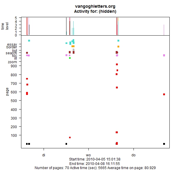
Figure 10: Visit visualisation
What we see is the types of pages that have been visited (Y-axis), against time (X-axis): in black the home page, then in red the 900 or so letters, then, colour-coded, the other page types: zooms, illustrations, searches, tables of contents, etc. Above, the time spent on these pages. The figure shows someone who arrives on Monday, returns over the next three days, and uses almost all of the site’s facilities. It is the sort of visitor that we like to see.
Of course a graphic like this only makes sense in conjunction with the log that shows the details of the pages the user has visited and what he or she was searching for. Another one that I like (Figure 11) shows someone who Friday evening late was told to leave the computer, and then on Saturday after the weekly shop went back to look at our site. Figure 12 shows the visitors at the exhibition being held in the Royal Academy, obviously very active.
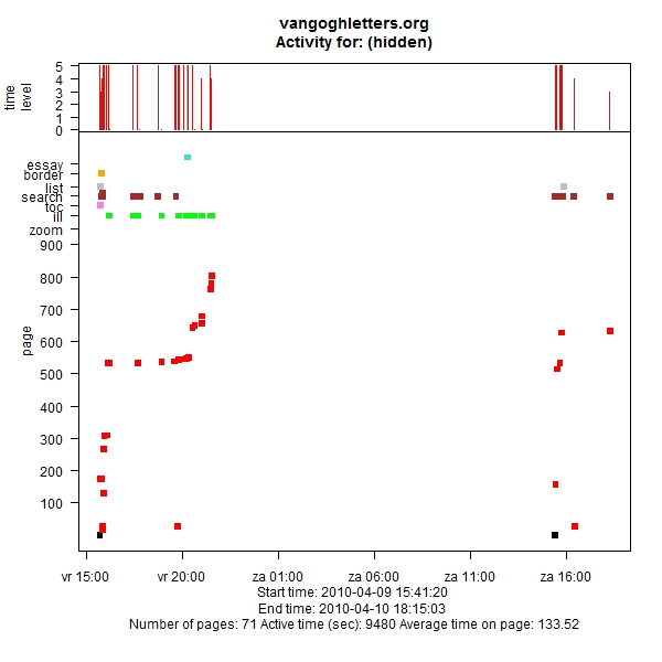
Figure 11: Return the next day
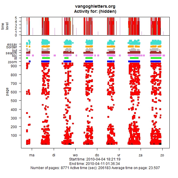
Figure 12: Visitors at the Royal Academy
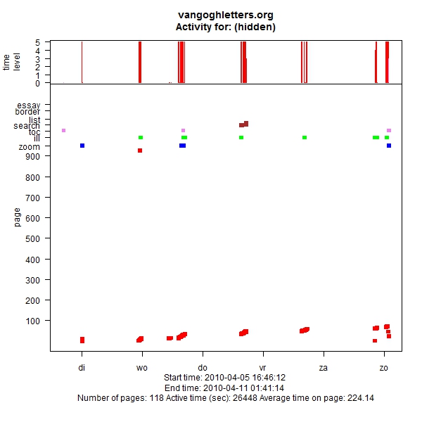
Figure 13: Reading sequentially
Figure 13, finally, shows someone returning on six consecutive days and continuing his or her reading at the next letter. Upon inspection of the logs, we found that this person did indeed work his or her way through letters 1 to 74, with an occasional sidestep, over the days of that week. So this is someone who should have bought the book! That at least, as I mentioned in the Introduction, was our idea when we created the edition: the researchers would use the Web site, the readers would use the book. More research is needed to prove this conclusively, but many of the site’s visitors show a pattern similar to the one exhibited in Figure 13, and in fact the large majority of letter accesses are sequential. This is not to say that no directed access is going on. There are also many visitors who perform one search, look at the result and then leave. But many visitors do read online, passing from one letter to the next. Probably not many will read all 902 letters that way, but then, presumably, neither will most of the book owners read every single letter.
Conclusion and Next Steps
From the above examples, it would seem that log analysis is obviously useful. It has helped detect a number of flaws in the site’s design, and especially talking this over with one of the site’s editors proved to be a very fruitful way of thinking up possible improvements to the site. To give an example: if we had thought about it, it would not have surprised us that people click only on the first few items in the list of letters with sketches. Those are not the letters with the interesting sketches, but how are the visitors to know which ones are interesting? Being confronted with the fact that people click the items at the beginning of the list, we realised that what we should have there is a list of thumbnails, or at least a preview option, rather than a text-only list.
Log analysis also helps understanding how our users use the site. It appears the conventional wisdom that people do not like advanced search might indeed be true. We might think of that when we are building the next edition. On the other hand, people do like the navigational searches: the searches embedded in hyperlinks. This confirms another conventional wisdom: people use the principle of least effort in their information-seeking behaviour. Not confirmed, however, was our expectation that the main access to the letters would be through search and tables of contents rather than sequentially.
There are also some lessons for the application developer, the main one being ‘ask the server for the data that you need rather than doing data filtering in the user’s browser.’ Another lesson: many products exist that do log analysis. At least to some extent however, the interesting work begins when analysing the records in terms of a specific site structure. Grouping relevant items together and removing irrelevant junk will require some form of programming or scripting.
There are clear limitations in what log analysis can do, but much more is possible than what we have seen here. I hope to explore more both of the technical possibilities and of the ways this can help us in doing higher-level characterisation of our users. Marcia Bates’ well known information search model divides information seekers in four groups, on the two dimensions of activity and directedness [13]. It would be interesting to assess that model’s validity for this site.
References
- Huygens Instituut KNAW http://www.huygensinstituut.knaw.nl/
- van Gogh Museum http://www.vangoghmuseum.nl/
- Vincent van Gogh The Letters http://vangoghletters.org/vg/
- Jansen, L., H. Luijten, and N. Bakker, eds. Vincent van Gogh – The Letters. The Complete Illustrated and Annotated Edition. 2009, Mercatorfonds, Thames & Hudson, Amsterdam University Press, Actes Sud: Brussels, London, Amsterdam, Arles.
- Ciula, A., The New Edition of the Letters of Vincent van Gogh on the Web. Digital Humanities Quarterly, 2010. 4(2).
- Ten Doesschate-Chu, P., [review] Vincent van Gogh, The Letters. The Complete Illustrated and Annotated Edition. Nineteenth-Century Art Worldwide, 2010. 9(2): p. 2010.
- Welger-Barboza, C. Van Gogh The Letters – L’à propos de l’édition numérique. L’observatoire critique 2010 (cited 21 January 2011)
http://observatoire-critique.hypotheses.org/281 - Nicholas, D., et al., The information seeking behaviour of the users of digital scholarly journals. Information Processing & Management, 2006. 42(5): p. 1345-1365.
- Warwick, C., et al., The LAIRAH Project: Log Analysis of Digital Resources in the Arts and Humanities. Final Report to the Arts and Humanities Research Council. 2006, School of Library, Archive and Information Studies. University College London: London
http://www.ucl.ac.uk/infostudies/claire-warwick/publications/LAIRAHreport.pdf - More background information about the edition http://vangoghletters.org/vg/about_1.html
- Hochheiser, H. and B. Shneiderman, Using interactive visualizations of WWW log data to characterize access patterns and inform site design. Journal of the American Society for Information Science and Technology, 2001. 52(4): p. 331-343.
- Chen, R., A. Rose, and B.B. Bederson. How people read books online: mining and visualizing web logs for use information. in 13th European conference on Research and advanced technology for digital libraries. 2009: Springer-Verlag.
- Bates, M.J., Toward an integrated model of information seeking and searching. The New Review of Information Behaviour Research, 2002. 3: p. 1-15.
