Visualising Building Access Data
Gary Brewerton and Jason Cooper describe how the imposition of visitor access control for safety purposes was developed into a useful management tool to measure library building usage.
1980 the Pilkington Library (the Library) was opened to support the current and future information needs of students, researchers and staff at Loughborough University. The building had four floors, the lower three forming the Library Service and the top floor hosting the Department of Library and Information Studies. Entry to the building was via the third floor (having been built against a hill) and there was a turnstile gate to count the number of visitors. The entrance of the building was revamped in 2000 and the turnstile replaced with a people counter that used an infra-red beam.
Whilst both the turnstile and people counter provided a figure on how many people used the building, they failed to differentiate between people using the Library and visitors to the Department of Library and Information Studies. This meant the Library was unable to rely upon these figures to gauge its footfall and usage demographics.
In 2012, the Department of Information Science (formerly the Department of Library and Information Studies) was relocated from the building and the space released to the Library. What started as the refurbishment of the top floor of the building was extended to include the introduction of rolling stacks on the first floor, an upgrade of enquiry desks throughout, and remodelling of the public area on the third floor [1].
Prior to the work commencing, a consultancy company was employed to undertake a health and safety survey of the building; its findings recommended a maximum occupancy figure and implementation of access control at the entry and exit to enforce this. This meant that for the first time users would have to identify themselves before entering or leaving the Library. This in turn raised the distinct possibility that the Library would be able to get accurate figures on not just how many people were using it, but also which departments and categories of users they were, when they used it and for how long.
Teething Troubles
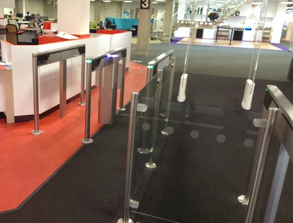
The Library re-opened in October 2013 with new access control gates after a thirteen week closure for the refurbishment. It soon became apparent that there were a few problems with the gates. Two entry gates had been installed but there was only a single exit gate despite there being room for another gate, creating significant queues for users trying to leave the building during busy periods. Moreover, the embedded card readers in the gates, used to identify users, proved difficult to locate, and would, on occasions, take a while to read the cards successfully.

Figure 1: Recently installed access control gates
Solutions to these two problems were soon found. New card readers were installed on the gates in a more prominent location that detected and read the cards more quickly. In addition, an order was placed for a second exit gate.
Whilst library management staff awaited the fitting of the second gate, their thoughts turned to what statistics the access control system could now provide. Answers to enquiries directed to the Facilities Management (FM) Department, which administers the access control systems throughout the institution, did not sound altogether promising. While FM was able to supply details of an individual’s trail through the system upon request, it was not able to provide the general statistics required.
This lack of statistics disappointed Library management and senior management of the University who had hoped for evidence to demonstrate that their investment in the Library refurbishment had been worthwhile. Further enquiries were made and it was determined that the access control system did generate log files that might provide at least some of the required data which could be made available to the Library and senior management.
Scoping Our Needs
Examination of the log files revealed that they held the user’s number, first and last name, which reader had processed the card, whether the access was successful or not, and the time of the transaction. After confirming that the logs contained enough data from which to produce usable statistics, it was important to decide exactly what questions needed answering. Following discussions with various Library staff, in particular the Customer Services Manager and Facilities Manager, the following set of six questions was drawn up:
- What is the total number of people who have visited the Library in a given period?
- Which academic departments use the Library building the most?
- What categories of users (e.g. undergraduates, researchers, visitors, etc.) use the Library building the most?
- What is the maximum number of people in the Library at any time?
- How long do people spend in the Library?
- What are the peak times for people entering and leaving the Library?
It was obvious that answers to the first question and the last three were all readily available from the log data. The second and third question would require the log data to be enriched with additional details from the institution’s personnel system, student records system or, more easily, the Library Management System (LMS). It was further decided that these answers would best be presented to management through the use of a dashboard style graphical interface, since Library staff had already experienced notable success using this method with its online reading lists system [2].
Developing the Dashboard
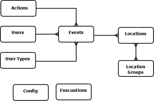
The first parts of the system that needed to be developed were the underlying database and the scripts that would populate it from the log files. The core table would be called events which would store each transaction from the log. To reduce the size of the table common recurring bits of information were stored in separate tables, e.g. details of locations, actions, users and their categories (undergraduate, postgraduate, staff, researcher, etc).

Figure 2: Database structure
The evacuations table stores the time of any evacuations of the building took place, as during these times the entries in the log would be unreliable, due to the gates being fixed open to allow everyone to leave the building quickly. The config table is used by the system to store useful bits of information that might take a while to calculate (eg earliest event in the system).
The logic of the import script is quite simple:
for each entry in the log file {
extract data fields
lookup the relevant user ID, location ID, action ID and user type ID
enrich the event data with some of the current users details
(part-time/full-time status, distance learner status and finalist status)
if the log entry does not already exist in the events table {
insert log entry into the events table
}
}
update the earliest and latest timestamps of events in the config table
After testing, it turned out that rather than looking up details from the database at the point they are needed, it was faster for the script to start by extracting all the user, location, actions and user type details from the database in one go and store them in memory in their own data structures. Using these data structures removed the need for a number of database queries for each line in the log file (ie those in the lookup stage and the enrichment stage).
The check to see if the log entry already exists in the events table is required as the log file being imported each day contains the last few days of log entries, therefore without this check there would be duplicate entries in the event table which would skew any stats produced.
After the import script, the next decision to be made was how to structure the code base. The two options were to have everything processed at the server side in a traditional Web site style, or to have an AJAX style interface [3] with the back-end providing data to the browser where they are then processed and rendered using JavaScript. The AJAX style was chosen, as the development team had used the AJAX style interface effectively in a number of other projects [4][5], and whereby in recognition of the benefit it derived from offloading some of the data processing to the client’s browser.
Developing the Back-end
Due to the system using an AJAX style interface, the back-end simply consists of 8 Perl CGI scripts [6]. All of the CGI scripts return their results in either plain JSON [7] format or, if the callback parameter has been specified, in a JSONP [8] format. The first CGI script retrieves a set of useful information required by the front-end to build its interface. This information consists of the current range of data in the systems, a list of possible user types and a list of departments. The other 7 CGI scripts are used by the front-end to access the data required for its reports and all accept the same 5 parameters:
- startDate – the start of the date range to assess (required)
- endDate – the end of the date range to assess (required)
- departmentCodes – a comma-separated list of department codes by which to limit the analysis (optional)
- userTypes – a comma separated list of the user categories to limit the analysis by (optional)
- restrictions – a comma-separated list of user attributes by which to limit the analysis (optional)
- callback – a function name to be used when passing results back in JSONP format (optional)
Developing the Front-end
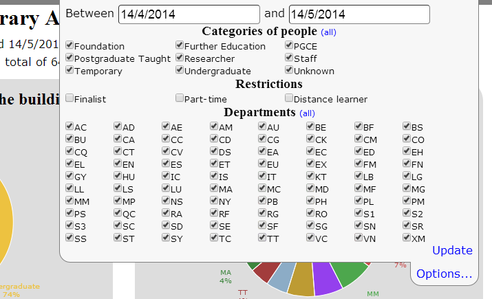
The front-end is a HTML5 Web page [9] and makes use jQuery [10], jQuery UI [11] and Flot [12] the jQuery graph plug-in. When the page first loads it calls a CGI script to obtain the information it needs to build the options part of its interface. Normally the options are hidden with only a tab at the top of the screen being displayed; but if the user clicks on the tab then the options interface is displayed (see Figure 3). Users can change the date range being reported and narrow down the results based upon department, user category and/or user attributes.

Figure 3: Options
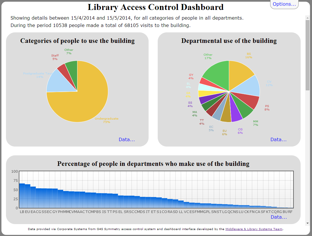
The dashboard (see Figure 4) itself consists of a summary followed by eight reports. The summary lists the options selected and the number of people who used the building and how many visits they actually made. Each report has a data link that, when clicked, will show a table of the underlying data used to plot the graphs.

Figure 4: Screenshot of access control dashboard
The eight reports mentioned are as follows:
- The first two reports are displayed as pie charts and show a breakdown of visits by the category of visitor in the first report and a breakdown of visits by department of visitor in the second
- The third report shows the percentage of users from each department who have used the library in the period being reported on
- The fourth report shows the total number of people to use the building each day in the reporting period
- The fifth report shows the occupancy of the building over the time being reported on (see figure 5), as well as the option to show a summary table of the underlying data for the graph. This report also allows the user to find out how many people were in the building at a specific point in time.
- The sixth report shows the length of time that people stay in the building for, while the seventh report shows the average number of people to use the building per day of the week
- The last report on the dashboard shows the hourly averages of people entering and leaving the building (see Figure 6).

Figure 5: Occupancy report
Tackling Missing Data
Due to the gates' teething troubles causing queues for users trying to exit during busy periods, at times Library staff had to lock the gates open till the queues had cleared. While this resolved the immediate inconvenience of the queue, it caused problems for the reporting system as there were no log entries for those users leaving the Library. This problem of data loss, to a lesser degree, also arises when users tailgate others when entering or leaving the building and their transactions are consequently never completely logged.

Figure 6: Hourly averages report
The issue of a small number of missing entrance and exit events did not represent much of a problem in most of the reports, as users of the system understand that the figures returned are an approximation; but for the occupancy graph (Figure 5), minor inaccuracies would accumulate. This resulted in it showing a steady increase in the use of the building which was misleading.
To tackle this anomaly, the occupancy report makes a few assumptions:
- It only counts exits that have a matching entrance for the user
- If it has seen that a user has entered the Library but does not detect a matching exit event within 48 hours, it assumes the user has left
If it does not register any entrance or exit events for two hours, it assumes the Library has closed and assumes everyone has left. The last assumption had to be made since a consistent closing time could not be assumed, as the Library’s opening hours varied and even include periods of 24/7 when it never closes.
Using the Dashboard
Since its development the dashboard has been used by the Library to gain a valuable insight into its user population. For the first time Library management knows which departments make most use of the building and so has been able to confirm anecdotal evidence on which categories of users visit, when, and for how long. The Library can now say, with some authority, that three quarters of all those entering are undergraduate students. This information has not only been useful to Library management but also of interest to others in the institution, such as FM and senior management. Moreover, it has helped provide answers to some external information requests such as the annual SCONUL return [13].
The dashboard is also an essential tool in reviewing occupancy levels and identifying periods of high demand. This information will prove critical in predicting the levels of demand for the Library building, allowing it to address this issue through changing opening hours, staffing and restricting access for some users.
Finally, the dashboard has provided a wealth of information for use in advocacy and marketing activities. A poster [14] was produced for the official opening of the refurbished Library which highlighted its popularity with students and staff alike. Information from the dashboard has also been used in blog posts, case studies and when liaison librarians are speaking to departments.
Conclusion
The purpose of introducing access control to the Pilkington Library was to enforce safe occupancy levels, but it has provided a variety of further benefits. The log data from the access control system has made it possible to answer many outstanding questions about those entering and leaving the Library. Development of a dashboard interface seemed an ideal approach to exposing this information to Library management and this has proven to be the case.
It is hoped that the dashboard will complement the Library’s existing business intelligence and allow it to manage and market its resources better. Being able to clearly identify and respond to patterns of Library usage represents a significant advantage, but combining this with other collated information could offer further benefits. For example, a future study comparing physical use of the Library against use of its virtual resources may well make interesting reading.
References
- Graham Walton. "Prize winners for completing Library refurb survey", 11 June 2014. Loughborough University Library Ad-Lib blog http://blog.lboro.ac.uk/blog/category/library/building-work
- Cooper, J., Knight, J. and Brewerton, G. (2013) Providing Information about Reading Lists via a Dashboard Interface, Code4Lib, 19.http://journal.code4lib.org/articles/7745
- Powers, S. (2007).Adding Ajax: Making Existing Sites More Interactive. O’Reilly Media.
- Jon Knight, Jason Cooper, Gary Brewerton. “Redeveloping the Loughborough Online Reading List System”. July 2012, Ariadne Issue 69 http://www.ariadne.ac.uk/issue69/knight-et-al
- Jason Cooper, Gary Brewerton. “Developing a Prototype Library WebApp for Mobile Devices”. July 2013, Ariadne Issue 71. http://www.ariadne.ac.uk/issue71/cooper-brewerton
- Guelich, S. Gundavaram, S. Birznieks G. (2000). CGI Programming with Perl, 2nd Edition. June 2000. O’Reilly Media.
- JSON: Introducing JSON http://www.json.org/
- Defining Safer JSON-P http://json-p.org/
- W3C. HTML5: A vocabulary and associated APIs for HTML and XHTML. W3C Last Call Working Draft 17 June 2014 http://www.w3.org/TR/html5/
- jQuery: The Write Less, Do More, JavaScript Library http://jquery.com/
- jQuery User Interface http://jqueryui.com/
- Flot: Attractive JavaScript plotting for jQuery http://www.flotcharts.org/
- SCONUL http://www.sconul.ac.uk/
- How is the transformed Library being used? May 2014. Loughborough University Library Ad-Lib blog http://blog.lboro.ac.uk/middleware/wp-content/uploads/2014/05/acPoster.pdf
Author Details
Email: g.p.brewerton@lboro.ac.uk
Web site: http://www.lboro.ac.uk/it/
Gary is currently Manager of the Middleware and Library Systems Team in IT Services, Loughborough University. He has over 20 years’ experience in both Higher Education and libraries.
Email: j.l.cooper@lboro.ac.uk
Web site: http://www.lboro.ac.uk/it/
Jason is a member of the Middleware and Library Systems Team at Loughborough University. Dr Cooper maintains a number of key Library systems as well as developing middleware solutions for the University.
